Wednesday, 25 April 2012

How did you use media technologies in the construction and research, planning and evaluation stages?

Throughout the researching stage, I was working on the Imac's at school, thought the use of the Internet, youtube and other useful sites were blocked, this Is when I used my laptop at home and researched videos especially as I couldn't do this a school. The majority of the research was searching for YouTube videos, and image for inspiration, YouTube Is a great website where people can share video, witch can reach a larger audience globally, many young Artist such as Justin Bieber and Conor Maynard have used Youtube to reach million's of people with their talent's. If I was able to I would promote the band, through YouTube. Here's an example of Justine Bieber, when he was Just starting out, he's an example of someone who has been successful from Youtube.

Discovering the band was very difficult and frustrating, after searching for unsigned bands on youtube, I came across two website, unsigned.com and unsignedband.com, after searching for dance songs, as my initial idea, I decided to search indie bands, and find one that is upbeat, witch I couldn't. A class mate told me to use Soundcloud, and this Is how I found It. It wasn't straight forward to get the song of soundcloud, but I was able to get eventually. I use the social Networking site Facebook, to contacting the band, witch was very easy and simple, they replied within a couple of hours.

The software I used for both my Anamatic and Music video was Imovie, it's very simple to use, especially for the Anamatic, as all you had to do is drag the music into Imovie, and drag the Pictures over it, this why I really like the Imac and it's software as it really easy to use. Both the Anamatic and music video were taken using the Cannon legeria F5200, the camera doesn't have the best quality, as I would love to use my own, but couldn't due to some problems, but Personally I think it helps enhance the low-fi approach to the music video, due to it being the first single of the New Album, many new bands use this approach, it adds realism, too the music video. The video Ok go - Here it Goes again, where the music video is shot in one take, is a great example of this.
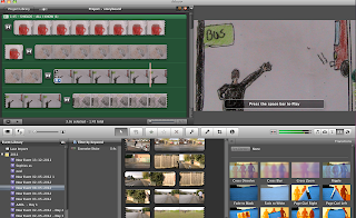


 This is me creating the Anamatic, using IMovie.
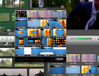
This is me using the the iMovie software, to use a transition, cross dissolve.


Another important piece of equipment was the Tripod, when holding the camera for a steady shot it was really hard not, to shake, this was effect the end shot greatly, and reduce the quality of the clip. Using the tripod enable for a smooth shot especially, when panning witch I use a lot in my music video. When using the tripod, on one of the Pan's I used a rubber band to pull the handle, this acts as a shock absorber and reduce the shakiness. All editing took place in school on the Apple macs, using the software Imovie, it's very easy to use, I have used many different types of software out side of school, such as Sony Vegas pro and pinnacle studios 12, these offer really good quality editing and effects, but I think for a project like this less is better, to keep it simple but effective. For my Digi-pak I used a digital camera, the quality didn't need be amazing as, the quality can be improved through the use of Photoshop and so I used a standard one from home. After uploading them, I used Photoshop to edit them, using various elements such as saturation and a gradient, tool witch help the light on the picture, I have previously used photoshop a number of times, and it's really easy to use, only using a couple of layer keeps it simple. After photoshop I then transferred it to the free Software Disclabel, this is when I added the blue colour in all of the pictures, to keep with the theme, the logo I used was found on Paint. When making the Digi-pak and poster the pictures where stretch a little more than i wanted but I couldn't help this, but i think the end result looks good.
Tuesday, 17 April 2012

What have you learned from audience feedback?

Monday, 2 April 2012

In what ways does your media product use, develop or challenge forms and conventions of real media 'products?


This is the video Fluorescent Adolescent.


Goodwin's six point's - Due to some problem's I wasn't able to talk about the last three point's of GoodWins, theory.


1. Music videos will demonstrate genre characteristics.
The genre of my band is indie, in order to incorporate the indie convention's I have made the music video upbeat, with the use of quick editing. After research I have found out that many indie music video's don't follow the normal convention's, much like Fluorescent Adolescent. 


2. There will be a relationship between lyrics and visuals.
Throughout the lyrics, they talk about "certainty lies in my memories" and "you follow me always, you follow me always from behind the line" this is shown in the music video, as the protagonist is going back to his indie roots, shown through a fast pace edit, to excite the audience. 


3. There will be a relationship between music and visuals.
The light hearted upbeat music fits with the clips, shown in the music video, the montage theme, goes in time with the fast pace clips, and when slowed down, I have used an establishing shot. 

4. There will be many close up shots of the band, as per request of the record label, as well as reoccurring motifs across the band‘s work. Throughout the music video, I didn't really use close-up of the protagonist as I wanted to create an uncertainty, the band member's aren't in the music video, as I have explained I wanted to make the band anonymous, so the audience listen to the music rather than the band.


5. There will be a sense of the notion of looking in and voyeurism.

Personally I don't think this is needed especially in a indie music video, but genre's such as POP and R&B use this all the time, as it can gain a lot of view's and sale's but genres like indie don't rely on this and rely on the music rather than voyeurism.


6. There will be intertextual references. As I have explained I have use the Zebra crossing throughout the theme in all my media products, such as the Magazine Advert, Digi Pak and music video, this refers to the famous Abey Road picture of the Beatles's advert, I think this helps the Three product's, appeal more, and will gain viewer's and importantly sales. 

Saturday, 25 February 2012

Ancillary Task - Magazine Advert

For my poster I was able to use my digital camera, witch turned out, to have great quality and better than my cam recorder given by the school, but it wasn't very good quality for picture taking, after previous experience with creating pictures with Photoshop and other software, I new that you can improve the quality and the overall effect of the picture, so It was just important to take some pictures, that reflect both the theme of my music video and concept.


After asking a few class mates I have decided to use, this picture for my Poster, this keeps with the theme of my digi-pak, but i have decided not to use it after trying to create a poster with the same effects as my CD digi-pak as It didn't turn out the way I wanted.


And so I have decided to use the same image as the CD cover, this again is a inter textual reference, and I feel as this is the most important image I could use, as it's so iconic, this will gain attention, especially from music lovers.


I explaining that I'm going to use the same image as the CD cover to the teacher and a few class mates, the class preferred this idea.


Feedback after first picture,
1."yer, the CD cover would look better as the Magazine advert"


Here's the original picture I created,


This Is the final Magazine advert, I'm very pleased with the end result.


I played around with the cropping tool, trying to use the best part possible. 


These are the setting's I used on the Advert, I wanted to saturate most of the colour out of the magazine cover, to highlight the white Zebra crossing. After this I decided to also keep all the writing white with a slight hint of grey, this will make It edgy but also easy to see from far away, and this should stand out, also the shields logo, Is easy to see and this Is what you notice first, along with the Zebra Crossing, witch I think  


Magazine Advertisement feedback -


1. " Good decision to use the front cover instead of the original idea"
2. " Font should be all the same"
3. " Advertises the main Protagonist rather that the band"


I have considered all the feedback.

Wednesday, 22 February 2012

Ancillary Task - Digi Pak

Firstly when planning my digi-pak I thought I should try and find the best software too use, and so I decided to look on google for the best software. After searching I was unsure, but I remembered using image editor adobe photoshop on a project outside of school, and you can get templates of a CD from it and so this is the software I'm going to use. I will be using the latest edition - photoshop CS5, to design them, and import it in to DiscLabel , and fit it to size.


After researching many digi-paks and CD covers, I really like the simple designs I think that these are the most effective. So in my digi pak ill incorporate the band name, a theme and a picture of the character in the music video. I will be making the song in my music video the main theme throughout the Digi pak and even the poster. I think this would work best. And so I thought i would just take some pictures, in various locations with the protagonist in it, then I will decide on what picture I think looks best, ill incorporate it on a poster and a Digi pak, and design a logo and theme that looks best. Also by taking a lot of pictures, if anything were not to turn out the way I wanted it to I could use a different picture.


Here is the front CD cover. I have taken a picture on a zebra crossing. My main inspirations for this were from the iconic picture of Abbey road, in Liverpool, of the Beatles album. If someone was looking for a CD in a shop, mine would  draw their attention, as the image of Abbey Road would stick in their mind, as its such an iconic scene, this should get people interested. This is an example of an intertextual, reference that many music fans will know, witch will promote the Album well.    


Front CD cover


Back CD cover


Spine of CD cover - I havnt been able to get the size right but, it would still have the same effect,


Disc 1 - A simple designe of a bus going bast, blurred, with a contrast of dark blure, which is keeping with the theme of the Digi-pak.


Feed back-
1. "It looks professional  and would look great on a CD rack"
2. "It would really stick out in a shop and looks unique"
3. "The CD colour scheme is to similar to the cover and the back"
4. "You can't see the titles clearly"

I was really pleased with the feedback of the final Digi-pak.

Monday, 20 February 2012

Magazine advertisement idea


 My first idea for my magazine advert, was to some how merge all three of these picture into a continuous picture, as if it was in three still time shots of me, but it was very difficult. I search many videos on Youtube, but couldn't find anythin useful, that could help. But my second idea will work just fine, i have decided to use the CD Cover instead, of this.