Saturday, 25 February 2012

Ancillary Task - Magazine Advert

For my poster I was able to use my digital camera, witch turned out, to have great quality and better than my cam recorder given by the school, but it wasn't very good quality for picture taking, after previous experience with creating pictures with Photoshop and other software, I new that you can improve the quality and the overall effect of the picture, so It was just important to take some pictures, that reflect both the theme of my music video and concept.


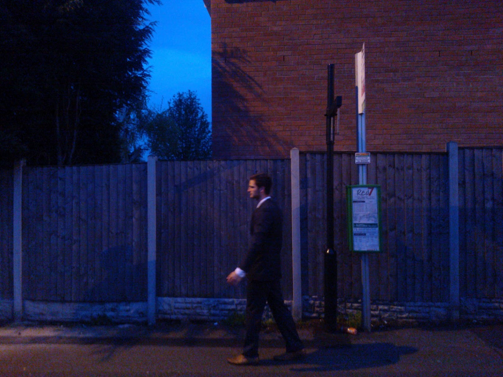
After asking a few class mates I have decided to use, this picture for my Poster, this keeps with the theme of my digi-pak, but i have decided not to use it after trying to create a poster with the same effects as my CD digi-pak as It didn't turn out the way I wanted.


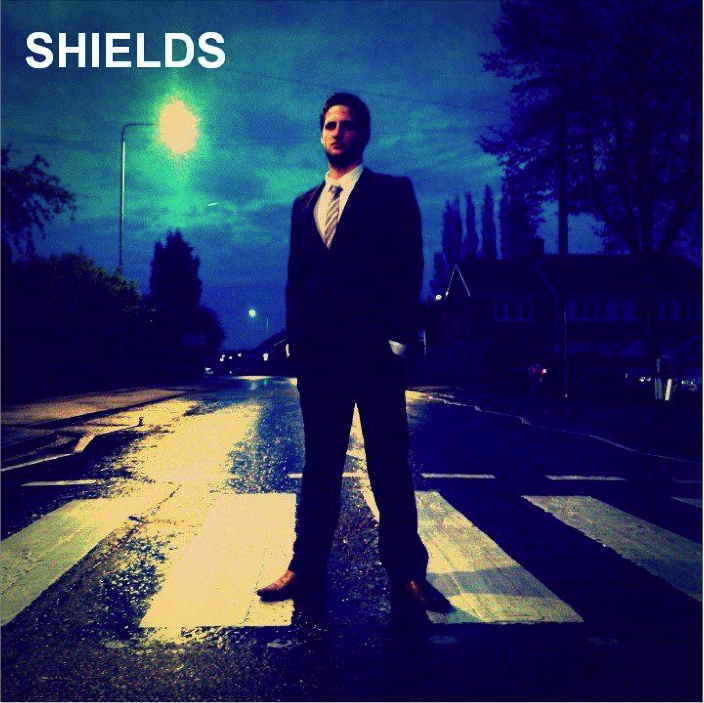
And so I have decided to use the same image as the CD cover, this again is a inter textual reference, and I feel as this is the most important image I could use, as it's so iconic, this will gain attention, especially from music lovers.


I explaining that I'm going to use the same image as the CD cover to the teacher and a few class mates, the class preferred this idea.


Feedback after first picture,
1."yer, the CD cover would look better as the Magazine advert"


Here's the original picture I created,


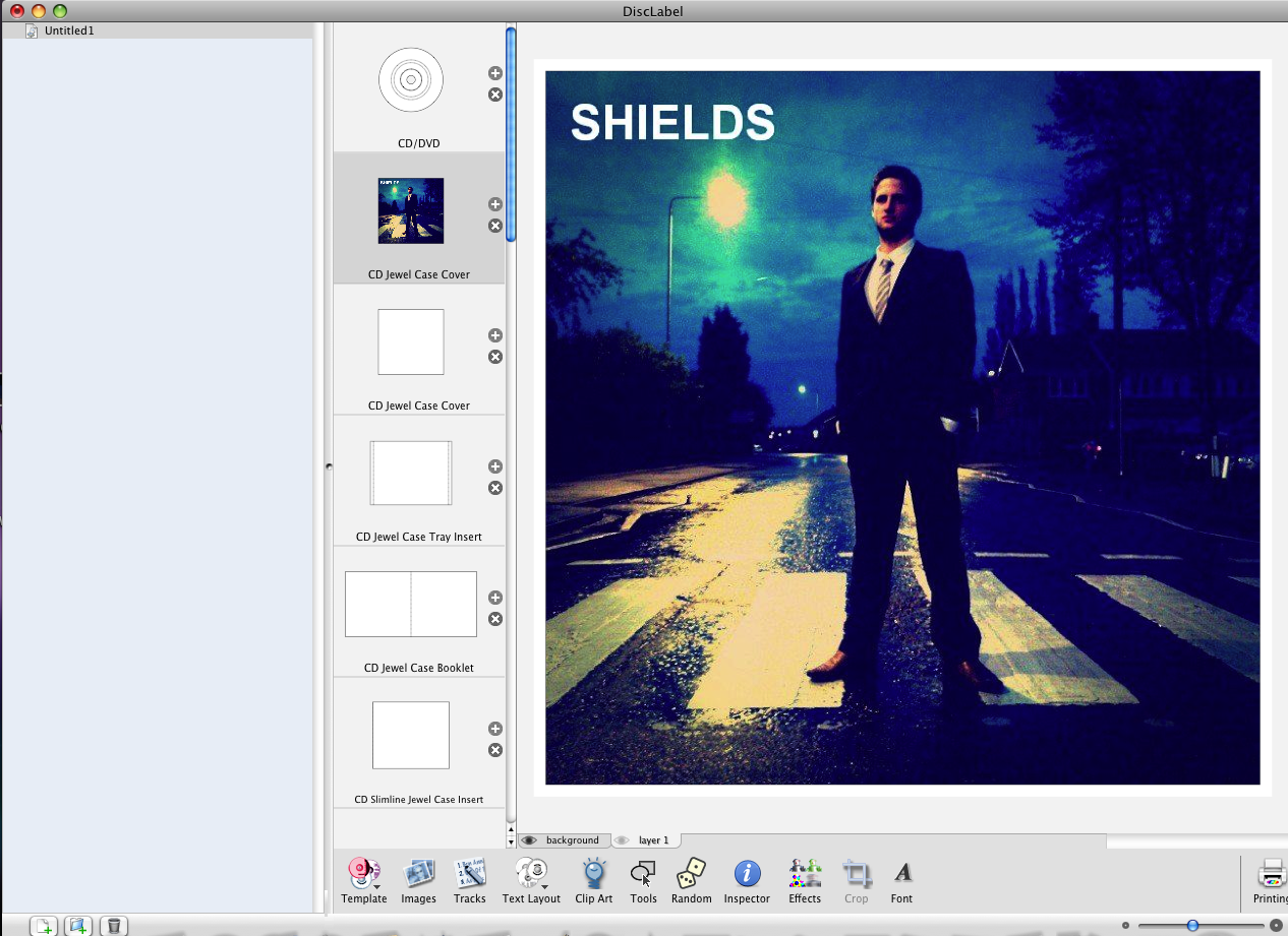
This Is the final Magazine advert, I'm very pleased with the end result.


I played around with the cropping tool, trying to use the best part possible. 


These are the setting's I used on the Advert, I wanted to saturate most of the colour out of the magazine cover, to highlight the white Zebra crossing. After this I decided to also keep all the writing white with a slight hint of grey, this will make It edgy but also easy to see from far away, and this should stand out, also the shields logo, Is easy to see and this Is what you notice first, along with the Zebra Crossing, witch I think  


Magazine Advertisement feedback -


1. " Good decision to use the front cover instead of the original idea"
2. " Font should be all the same"
3. " Advertises the main Protagonist rather that the band"


I have considered all the feedback.

Wednesday, 22 February 2012

Ancillary Task - Digi Pak

Firstly when planning my digi-pak I thought I should try and find the best software too use, and so I decided to look on google for the best software. After searching I was unsure, but I remembered using image editor adobe photoshop on a project outside of school, and you can get templates of a CD from it and so this is the software I'm going to use. I will be using the latest edition - photoshop CS5, to design them, and import it in to DiscLabel , and fit it to size.


After researching many digi-paks and CD covers, I really like the simple designs I think that these are the most effective. So in my digi pak ill incorporate the band name, a theme and a picture of the character in the music video. I will be making the song in my music video the main theme throughout the Digi pak and even the poster. I think this would work best. And so I thought i would just take some pictures, in various locations with the protagonist in it, then I will decide on what picture I think looks best, ill incorporate it on a poster and a Digi pak, and design a logo and theme that looks best. Also by taking a lot of pictures, if anything were not to turn out the way I wanted it to I could use a different picture.


Here is the front CD cover. I have taken a picture on a zebra crossing. My main inspirations for this were from the iconic picture of Abbey road, in Liverpool, of the Beatles album. If someone was looking for a CD in a shop, mine would  draw their attention, as the image of Abbey Road would stick in their mind, as its such an iconic scene, this should get people interested. This is an example of an intertextual, reference that many music fans will know, witch will promote the Album well.    


Front CD cover


Back CD cover


Spine of CD cover - I havnt been able to get the size right but, it would still have the same effect,


Disc 1 - A simple designe of a bus going bast, blurred, with a contrast of dark blure, which is keeping with the theme of the Digi-pak.


Feed back-
1. "It looks professional  and would look great on a CD rack"
2. "It would really stick out in a shop and looks unique"
3. "The CD colour scheme is to similar to the cover and the back"
4. "You can't see the titles clearly"

I was really pleased with the feedback of the final Digi-pak.

Monday, 20 February 2012

Magazine advertisement idea


 My first idea for my magazine advert, was to some how merge all three of these picture into a continuous picture, as if it was in three still time shots of me, but it was very difficult. I search many videos on Youtube, but couldn't find anythin useful, that could help. But my second idea will work just fine, i have decided to use the CD Cover instead, of this.


Sunday, 19 February 2012

Magazine and Digi pak raw pictures

These are some shots I have taken, in different location, im going to pick the pictures that look best. I asked the class witch picture would look best, for the poster and digipak. When asking others which image they prefer as a front cover, poster and back cover and which would be more effective at attracting them to buy it, immediately people liked the zebra crossing picture, and said that should be for the front cover, the picture against the wall looking, left should be the back cover as if Im looking at the song list and the magazine cover should be the one underneath the light, leaning against it, the decisions will be highlighted in the final pictures. The images were very popular, and could have an effect on sales, and attract new customers, especially as the zebra crossing, image is similar to that of the Beatles Album cover, and is a inter-textual reference. 


Some comments - "The zebra crossing picture is great, especially as it's in your video"


"All the shots, look similar in terms of lighting, witch will be good for the theme"


"you need to edit them, with darker colors"


"the first three pictures work best, the other don't look good in my opinion"


"the last picture is to dark, and not clear, I wouldnt use that one"
I considered all the good and bad feedback. 


Digi pak Process

Here are various shots of me using the software to create my Digi-pak, a combination of both Photoshop and DiscLebel, I would create the photo in Photoshop then use Hotmail to send it to DiscLebel and fit it to size, I can also add anything I needed to. This is me using Disclabel, just putting it to size of the front cover. Throughout the Digi-pak ill be using the same blue theme, because I think it works well.


Here's me adding a bar code.


This is me using a color correction on the spine, witch is a dark blue, witch it goes with the theme of my CD.


The same Blue theme is used.


This is the blue effect I gave to all the digi-pak.
This tool, I used in most of my image's, it's a light effect, where you drag it from, it become's lighter, this especially came in handy on the back cover, as I wanted to add a light effect so that you could see the writing, and also as if it was natural light, or a lamppost witch it was but the light wasn't very clear.

This again is me using a blue, color but using Disclabel, it used in all my final product's as this is the theme of the digi-pak.


This is me using the Zoom in, this really helped as it was in more detail.

Friday, 17 February 2012

Shield band logo

It's a solid and strong word. With the use of white Logo, witch stand's out on the background, so it's easy to see, especially on my magazine Advertisement, where the background is very dark. The word Shield cannote's, protection and security, for example for my Advert magazine and CD cover, is a low angle shot, of the the protagonist. To show dominance.


Wednesday, 15 February 2012

"Humbug" Album Advert Analysis - Arctic Monkey's


The album release ‘Humbug’ appears simplistic with both limited color and detail. There is a central image of the bands heads merged together to create a circled image of their heads. Te bizarre concept of the image is what grabs’s the attention. I want to incorporate something in my advertisement that is eye catching.  


The band’s cartoon-like logo also features in the central image as if the letters have been cut out. With a bright yellow/beige base/background colour this stands out against the burgundy/maroon shade of the circular circular central image.At the top of the page the album title ‘Humbug’ is on display in a red font which is very quirky, it’s in the same maroon colour as the circular central image. Below is ‘The Album’ in a more vivid pink shade. This mixes the colour scheme up slightly adding more variety to the piece. It lets the reader know immediately what it is they are looking at, it’s informative.
Towards the bottom of the page is a picture of the album cover. This helps readers by giving them an insight as to what they are to look for if they go out to purchase the album, it’s similar to the Album cover. I believe you can gain an understanding of what the music will be like from an album cover and its artwork. It is very dependent on the genre. However I believe this theory is not always a good one to follow. In generalities it is correct but not always. A band may be ironic and have a cheerful looking album cover and a track list consisting of the heaviest most depressing songs in the history of music. The main use of the album artwork featuring on the advert are to promote, however possible. The words ‘Out Now’ stand out and tell the buyer’s that it is available, and can be published.
At the very bottom of the page are two website links one is the bands’ website the other is the record label’s site, showing convergence. Alongside these website addresses is the label company’s logo. This helps promote the record company, if fans enjoy Arctic Monkeys and their music they may be intrigued to hear other bands by this label.


.