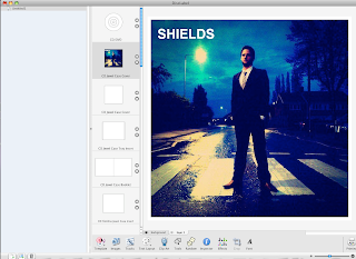
 Here are various shots of me using the software to create my Digi-pak, a combination of both Photoshop and DiscLebel, I would create the photo in Photoshop then use Hotmail to send it to DiscLebel and fit it to size, I can also add anything I needed to. This is me using Disclabel, just putting it to size of the front cover. Throughout the Digi-pak ill be using the same blue theme, because I think it works well.
This is me using a color correction on the spine, witch is a dark blue, witch it goes with the theme of my CD.
The same Blue theme is used.
This is the blue effect I gave to all the digi-pak.
This tool, I used in most of my image's, it's a light effect, where you drag it from, it become's lighter, this especially came in handy on the back cover, as I wanted to add a light effect so that you could see the writing, and also as if it was natural light, or a lamppost witch it was but the light wasn't very clear.
This again is me using a blue, color but using Disclabel, it used in all my final product's as this is the theme of the digi-pak.
This is me using the Zoom in, this really helped as it was in more detail.


No comments:
Post a Comment